

| 일 | 월 | 화 | 수 | 목 | 금 | 토 |
|---|---|---|---|---|---|---|
| 1 | 2 | 3 | 4 | 5 | 6 | 7 |
| 8 | 9 | 10 | 11 | 12 | 13 | 14 |
| 15 | 16 | 17 | 18 | 19 | 20 | 21 |
| 22 | 23 | 24 | 25 | 26 | 27 | 28 |
| 29 | 30 | 31 |
- Collpasing Header
- Intent
- Extras
- Android
- Compose
- 안드로이드
- nestedScroll
- Kotilin
- AnchoredDraggable
- EdgetoEdge
- playstore
- BottomSheetScaffold
- StickyHeader
- fling
- Flexiblie BottomSheet
- NestedScrollConnection
- bottomsheet
- 모바일
- thumbnail
- enableEdgetoEdge
- ModalBottomSheet
- Today
- Total
choiminjun 블로그
3가지 이상의 상태를 가지는 바텀시트 구현(+ 하단의 고정된 버튼 추가하기) 본문
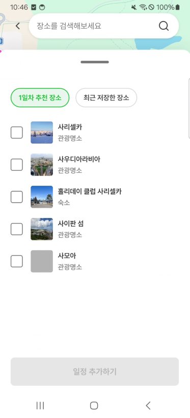
프로젝트를 진행하면서 다음과 같이 3가지 이상의 상태를 가지는 다양한 바텀시트를 구현해야 했다. 유의할점은 모든 바텀시트에 하단에 "일정 추가하기" 버튼이 존재해야 한다는 것이다.
ex) Hiden, 55%, Full


ex) 23%, 55%, 88%


시행착오
1. ModalBottomSheet
- 바텀시트를 제외한 공간이 Scrim 처리 및 터치가 불가능해지기 때문에 지도와 상호작용을 해야하는 바텀시트의 요구사항과 적합하지 않았다.
- Modal이라는 용어 자체가 화면의 다른 요소들과 상호작용해야 하는 컴포넌트로서 적합하지 않은 것 같다.
2. BottomSheetScaffold
- BottomSheetScaffold를 사용하면 다음과 같은 3가지의 상태까지는 가능하다. Hiden, PartiallyExpanded, Expanded
- PartiallyExpanded를 사용하려면 sheetPeekHeight 속성을 필수로 사용해줘야 한다.
- 하지만, 일정 추가하기 버튼이 무조건 아래쪽에 보이는 형태의 바텀시트를 구현하는 것이 불가능했다. 바텀시트의 content들은 위에서부터 보여지기 때문에 아래쪽에 있는 ui는 잘릴 수 밖에 없었다.
- (참고) 또한, if문을 통해 각 화면의 바텀시트마다 다른 요소를 표시하면 애니메이션이 약간 부자연스러운 느낌도 있었다.
3. 오픈소스 라이브러리 FlexibleBottomSheet
https://github.com/skydoves/FlexibleBottomSheet
GitHub - skydoves/FlexibleBottomSheet: 🐬 Advanced Compose Multiplatform bottom sheet for segmented sizing, non-modal type, an
🐬 Advanced Compose Multiplatform bottom sheet for segmented sizing, non-modal type, and allows interaction behind the bottom sheet similar to Google Maps. - skydoves/FlexibleBottomSheet
github.com
- 해당 오픈소스 라이브러리의 최신 버전이 내가 현재 진행하고 있는 프로젝트의 Kotlin 버전과 호환되지 않아서 최신 기능을 사용할 수 없었다.
- FullyExpanded를 사용했을 때tatusBarPadding이 적용되어 있어서 화면 끝까지 확장되지 않았다.(최신 버전일 경우 아닐 수도 있다)
- 해당 오픈소스 라이브러리에서도 일정 추가하기 버튼이 무조건 아래쪽에 보이는 형태의 바텀시트를 구현하는 것이 불가능했다.
해결방법
위와 같은 문제들로 인해 다음 블로그 글을 참고하여 AnchoredDraggable과 offset을 통한 바텀시트를 직접 구현하여 해결했다.
제휴점 목록/지도 통합기: 26배 폭증한 비용부터 아키텍처 최적화까지
안녕하세요, 여기어때에서 안드로이드 앱 개발을 담당하고 있는 소프트웨어 개발자 그루입니다.
techblog.gccompany.co.kr
AnchoredDraggable과 Offset을 활용한 바텀시트 구현
- 기본 원리는 Offset 0을 기준으로 양수(+) 방향으로 바텀시트를 아래로 밀어내는 방식이다.
- ModalBottomSheet, BottomSheetScaffold의 BottomSheet도 AnchoredDraggable을 기반으로 한다.
1. 우선 각각 사용할 바텀시트의 상태를 정의한다.
@Immutable
enum class AddItineraryBottomSheetValue {
    Expanded,
    PartiallyExpanded,
    Collapsed,
}

    val density = LocalDensity.current
    val windowInfo = LocalWindowInfo.current
    val screenHeightPx = windowInfo.containerSize.height.toFloat()
    val anchors = DraggableAnchors {
        AddItineraryBottomSheetValue.Collapsed at screenHeightPx * 0.77f
        AddItineraryBottomSheetValue.PartiallyExpanded at screenHeightPx * 0.45f
        AddItineraryBottomSheetValue.Expanded at screenHeightPx * 0.12f
    }
    val sheetState = rememberNDGLNonModalBottomSheetState(
        initialValue = AddItineraryBottomSheetValue.PartiallyExpanded,
        anchors,
    )
2. NonModalBottomSheet를 다음과 같이 구현한다.
data class NonModalBottomSheetState<T>(
    val anchoredDraggableState: AnchoredDraggableState<T>,
)

@Composable
fun <T> rememberNonModalBottomSheetState(
    initialValue: T,
    anchors: DraggableAnchors<T>,
): NonModalBottomSheetState<T> {
    val draggableState = remember(anchors) {
        AnchoredDraggableState(
            initialValue = initialValue,
            anchors = anchors,
        )
    }

    return remember(draggableState) {
        NonModalBottomSheetState(draggableState)
    }
}

@Composable
fun <T> NonModalBottomSheet(
    modifier: Modifier = Modifier,
    sheetState: NonModalBottomSheetState<T>,
    content: @Composable () -> Unit,
) {
    val coroutineScope = rememberCoroutineScope()
    val flingBehavior = AnchoredDraggableDefaults.flingBehavior(
        state = sheetState.anchoredDraggableState,
        positionalThreshold = { distance -> distance * 0.5f },
    )
    val nestedScrollConnection = consumeSwipeWithinBottomSheetBoundsNestedScrollConnection(
        anchoredDraggableState = sheetState.anchoredDraggableState,
        orientation = Orientation.Vertical,
        onFling = { velocity ->
            coroutineScope.launch {
                sheetState.anchoredDraggableState.anchoredDrag {
                    val scrollFlingScope = object : ScrollScope {
                        override fun scrollBy(pixels: Float): Float {
                            dragTo(sheetState.anchoredDraggableState.offset + pixels)
                            return pixels
                        }
                    }
                    with(flingBehavior) {
                        scrollFlingScope.performFling(velocity)
                    }
                }
            }
        },
    )

    Box(
        modifier = modifier
            .offset {
                IntOffset(0, sheetState.anchoredDraggableState.offset.roundToInt())
            }
            .anchoredDraggable(
                state = sheetState.anchoredDraggableState,
                orientation = Orientation.Vertical,
                flingBehavior = flingBehavior,
            )
            .nestedScroll(nestedScrollConnection),
    ) {
        content.invoke()
    }
}
- 바텀시트 내부에 LazyColumn이 존재하기 때문에, 사용자가 화면을 밀었을 때 바텀시트 내부가 스크롤되어야 하는지, 바텀시트 자체가 움직여야 하는지 뷰 시스템이 혼란스러워하기 때문에 다음과 같은 NestedScrollConnection을 바텀시트에 적용해주었다.
- NestedScrollConnection 소비 순서 정리
스크롤 발생 -> onPreScroll(부모가 먼저 소비) -> 자식 스크롤 처리 -> onPostScroll (남은 거 부모가 처리)
fling 발생 -> onPreFling(부모가 먼저 소비) -> 자식 Fling 처리 -> onPostFling(남은 거 부모가 처리)
- anchoredDraggableState.dispatchRawDelta(delta): raw data(픽셀 단위 이동량)을 즉시 anchoredDraggableState에 적용
- flingBehavior.performFling: flingBehavior가 nestedScroll에서 넘어온 velocity를 받아서, positionalThreshold를 기준으로 목표 앵커를 결정하고, anchoredDrag 블록 안에서 dragTo()를 통해 이동한다. 다음 앵커로 넘어가기 충분하면 다음 앵커로 snap, 충분하지 않다면 원래 앵커로 snap 한다.
fun <T> consumeSwipeWithinBottomSheetBoundsNestedScrollConnection(
    anchoredDraggableState: AnchoredDraggableState<T>,
    orientation: Orientation,
    onFling: (velocity: Float) -> Unit,
): NestedScrollConnection =
    object : NestedScrollConnection {
// delta < 0: 위로 스크롤을 의미
// 위로 스크롤할 때 -> 바텀시트가 먼저 올라가고 LazyColumn 스크롤 됨
        override fun onPreScroll(available: Offset, source: NestedScrollSource): Offset {
            val delta = available.toFloat()
            return if (delta < 0 && source == NestedScrollSource.UserInput) {
                anchoredDraggableState.dispatchRawDelta(delta).toOffset()
            } else {
                Offset.Zero
            }
        }

// LazyColumn이 더이상 스크롤하지 못하면 남은 delta를 바텀시트가 소비함
        override fun onPostScroll(
            consumed: Offset,
            available: Offset,
            source: NestedScrollSource,
        ): Offset {
            return if (source == NestedScrollSource.UserInput) {
                anchoredDraggableState.dispatchRawDelta(available.toFloat()).toOffset()
            } else {
                Offset.Zero
            }
        }

// 위로 스크롤하다가 손가락을 뗏을 때(위로 Fling 했을 때) -> 바텀시트가 앵커로 snap
        override suspend fun onPreFling(available: Velocity): Velocity {
            val toFling = available.toFloat()
            val currentOffset = anchoredDraggableState.requireOffset()
            val minAnchor = anchoredDraggableState.anchors.minPosition()
            return if (toFling < 0 && currentOffset > minAnchor) {
                onFling(toFling)
                available
            } else {
                Velocity.Zero
            }
        }

// LazyColumn이 끝까지 스크롤되고 남은 velocity를 바텀시트가 처리
        override suspend fun onPostFling(consumed: Velocity, available: Velocity): Velocity {
            onFling(available.toFloat())
            return available
        }

        private fun Float.toOffset(): Offset =
            Offset(
                x = if (orientation == Orientation.Horizontal) this else 0f,
                y = if (orientation == Orientation.Vertical) this else 0f,
            )

        @JvmName("velocityToFloat")
        private fun Velocity.toFloat() = if (orientation == Orientation.Horizontal) x else y

        @JvmName("offsetToFloat")
        private fun Offset.toFloat(): Float = if (orientation == Orientation.Horizontal) x else y
    }
바텀시트 하단에 버튼 고정하기
- 위와 같은 방법으로 여러 상태를 가지는 바텀시트는 구현이 가능하다. 하지만 여전히 바텀시트 가장 하단에 있는 일정 추가하기 버튼은 보이지 않는다.
- 바텀시트는 다음과 같은 구조였다
Column
├─ Header
├─ LazyColumn(modifier.weight(1f))
└─ AddItineraryButton
- 해결방법은 Column의 가장 하단에 offset 크기만큼의 Spacer를 추가하는 것이다.
Column(Modifier.fillMaxSize())
├─ Header
├─ LazyColumn(modifier.weight(1f))
├─ AddItineraryButton
└─ Spacer(modifier = Modifier.height(with(density) { sheetState.anchoredDraggableState.offset.toDp() }))
- Spacer가 offset 크기만큼 공간을 차지하면, weight(1f)를 가진 LazyColumn의 높이가 그만큼 줄어든다.
- 결과적으로 AddItineraryButton이 위로 올라가게 되고, offset으로 전체 Column이 아래로 밀려도 버튼은 화면의 가시 영역 하단에 정확히 위치하게 된다.
- Spacer 자체는 화면 밖에 위치하므로 보이지 않는다.
- BottomSheetScaffold도 AnchoredDraggable 기반으로 동일한 방법을 사용할 수는 있겠으나 anchoredDraggableState에 직접적으로 접근이 불가능하도록 캡슐화되어 있기 때문에 하단에 버튼을 고정하기 번거롭다.
최종 결과물

참고 문서
제휴점 목록/지도 통합기: 26배 폭증한 비용부터 아키텍처 최적화까지
안녕하세요, 여기어때에서 안드로이드 앱 개발을 담당하고 있는 소프트웨어 개발자 그루입니다.
techblog.gccompany.co.kr
- 해당 오픈소스 라이브러릴 사용하지는 않았지만 개발하면서 바텀시트에 대한 여러가지 요구사항에 대해 공부할 수 있었다.
Building a Google Maps Style Bottom Sheet with Jetpack Compose
Google Maps popularized a bottom sheet pattern that most Android developers recognize immediately: a small panel peeking from the bottom of…
proandroiddev.com
- 다음과 같이 layout을 직접 설계하는 방법도 있는 듯하다. 가장 난이도가 높은 방법인 것 같다.
https://www.youtube.com/watch?v=KnGFJ6Byd7U
- Deprecated된 방식(AnchoredDraggable)
https://fvilarino.medium.com/exploring-jetpack-compose-anchored-draggable-modifier-5fdb21a0c64c
Exploring Jetpack Compose Anchored Draggable Modifier
In this short article we will learn how to use the new anchorDraggable modifier released with Jetpack Compose Foundation 1.6.0-alpha01 .
fvilarino.medium.com
'Android' 카테고리의 다른 글
| Compose에서 부드러운 Collapsing Header 구현하기: stickyHeader vs NestedScrollConnection (0) | 2026.03.16 |
|---|---|
| Edge-to-edge 공부 (0) | 2025.12.22 |
| PlayStore 앱 열기로 진입 시 Intent는 extras가 존재한다 (0) | 2025.12.22 |


